1. Bricolage Grotesque: Meet Your New Design Best Friend
This gorgeous geometric sans-serif by Mathieu Triay isn’t just another pretty face – it’s a powerhouse of versatility that makes your designs sing!
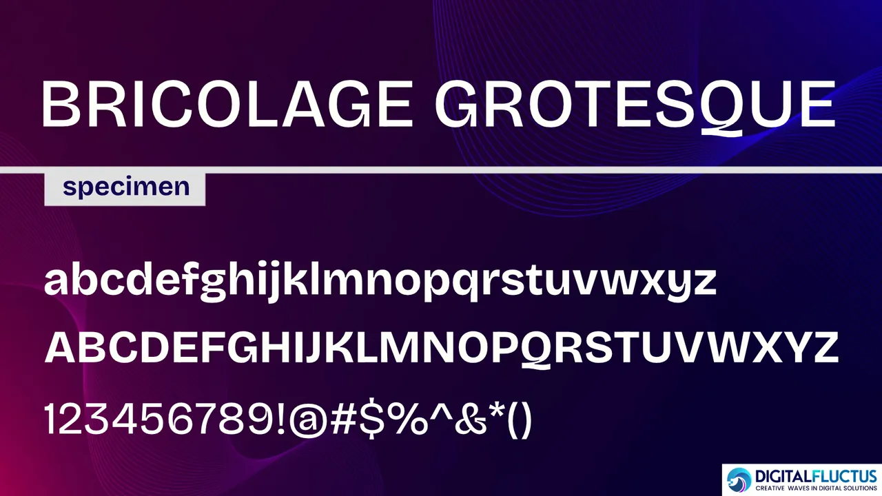
What Makes It Special?
- A perfect mix of playful charm and crystal-clear readability
- 7 weights + matching italics = endless creative possibilities
- Works beautifully for both eye-catching headlines and easy-to-read body text
Perfect For:
- Modern branding that stands out
- Clean, professional web design
- Editorial layouts that pop
- Any project needing that extra touch of personality
Why You’ll Love It: Just imagine having a font that’s professional enough for serious business but has just enough flair to make your designs memorable. That’s Bricolage Grotesque – it’s like having a Swiss Army knife in your design toolkit! ✨
Download Link – https://fonts.google.com/specimen/Bricolage+Grotesque
2. Anybody: The Font That Makes Everyone Smile!
Why You’ll Fall in Love with Anybody This charming sans-serif font by Eben Sorkin isn’t just a typeface – it’s like a warm hug for your designs!
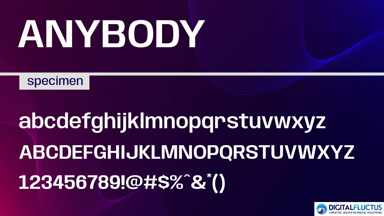
✨ What Makes It Special?
- Delightfully rounded letters that radiate friendliness
- An impressive family of 8 weights and 18 styles to play with
- Perfect balance of fun and functionality
- Reads beautifully in both big headlines and smaller sizes
Perfect For:
- Brands that want to feel warm and welcoming
- Kid-friendly designs that spark joy
- Social media posts that pop
- Any project needing that extra touch of friendliness
The Magic Touch Imagine having a font that makes your audience feel instantly welcome – that’s Anybody! It’s like having a friendly face in your design toolkit that works everywhere from playful children’s books to professional branding. 🌟
Pro tip: Its rounded corners and open letterforms make it especially great for digital screens, where clarity meets charm! ✨
Download Link – https://fonts.google.com/specimen/Anybody
3. Alfabet: Where Geometry Meets Genius!
The Story Behind the Style Meet Alfabet – a stunning sans-serif font born from three years of passion and precision by Mateusz Machalski. Drawing inspiration from Swiss and German design masters, it’s where bold meets beautiful! ✨
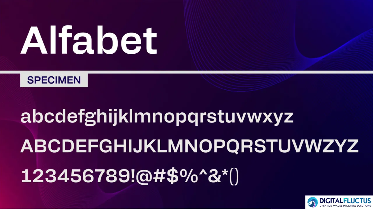
Why Alfabet Stands Out:
- Born from Swiss-German design excellence
- 18 stunning styles to fuel your creativity
- Speaks multiple languages (Latin, Greek, and Cyrillic)
- And the best part? It’s absolutely FREE! 🎁
Perfect For:
- Global brands seeking unity across languages
- Modern design projects that demand attention
- Clean, bold headlines that command presence
- Professional layouts with international reach
The Power of Precision Think of Alfabet as your design superhero – it’s bold, it’s geometric, and it’s ready to make your projects look absolutely incredible! Whether you’re crafting a global brand or designing a sleek modern website, Alfabet brings that perfect mix of strength and sophistication. 💫
Ready to give your designs that professional edge? Alfabet is waiting to transform your next project! ✨
Download Link – https://fonts.adobe.com/fonts/alfabet
4. Cheee: The Font That Makes You Smile!
Why Everyone’s Crushing on Cheee Imagine a font that gives your designs a big, warm hug! That’s Cheee by Ohno Type Co. – it’s like your favorite comfort food turned into typography! 🎨
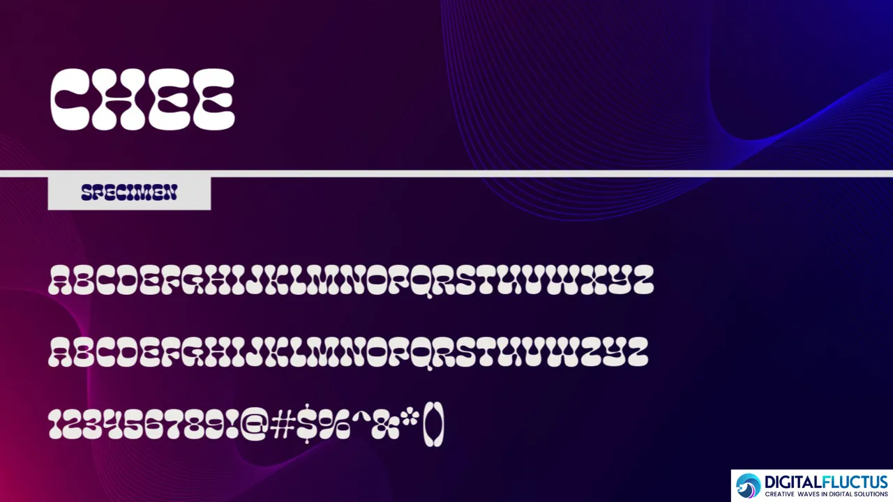
✨ What Makes Cheee So Special?
- Big, bouncy letters that spark joy
- Soft, rounded edges that feel like a friendly wave
- Super readable despite all its personality
- Works like magic in print AND digital
Perfect For:
- Fun-loving brands that want to stand out
- Eye-catching posters that demand attention
- Product packaging that makes people smile
- Any design that needs an extra sprinkle of happiness
The Joy Factor Picture this: A font so cheerful it could brighten anyone’s day! Cheee isn’t just a typeface – it’s like having a bundle of happiness in your design toolkit. Whether you’re creating playful product labels or scroll-stopping headlines, Cheee brings the fun while keeping things crystal clear! 🌟
Ready to add some sunshine to your designs? Let Cheee bring the happy vibes! ✨
Download Link – https://fonts.adobe.com/fonts/cheee
5. Epilogue: Where Style Meets Simplicity!
The Perfect Balance Say hello to Epilogue by Tyler Finck – a font that’s like your most versatile friend who always knows exactly what to wear! It’s sophisticated yet approachable, just like that perfect cup of coffee. ☕
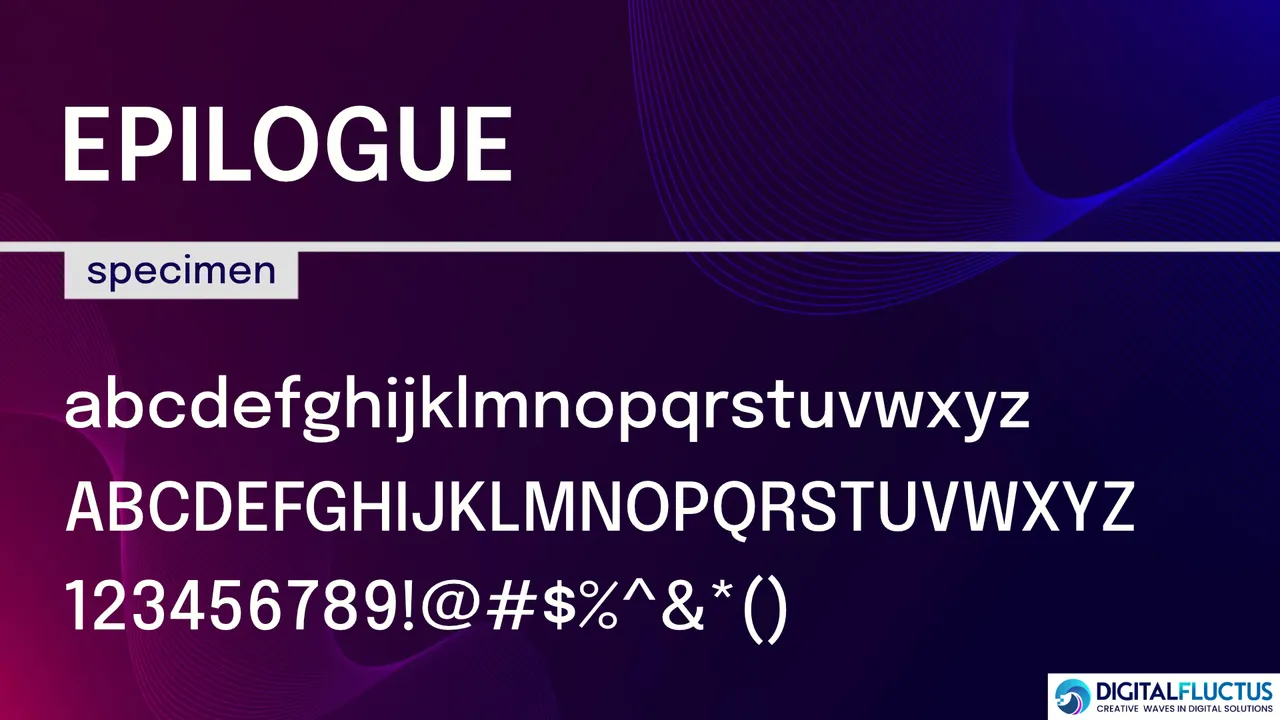
What Makes Epilogue Special:
- 9 weights + matching italics = endless possibilities
- Friendly rounded shapes that welcome readers
- Subtle personality that knows when to shine
- Works everywhere from tiny phone screens to giant billboards
Perfect For:
- Modern brands that want to feel human
- Editorial designs that need to tell stories
- Digital interfaces that feel fresh and friendly
- Any project needing that perfect balance of style and readability
Why You’ll Love It Think of Epilogue as your design Swiss Army knife – it’s ready for anything! Whether you’re crafting sleek headlines or comfortable reading experiences, this font brings that perfect mix of character and clarity. 🎯
Ready to make your designs both beautiful AND readable? Epilogue is your new best friend! 💫
Download Link – https://fonts.google.com/specimen/Epilogue
6. Alkaline: Typography with an Edge!
Meet Your Design Rebel Ready to shake things up? Alkaline by Jonathan Ball isn’t just a font – it’s an attitude! This bold beauty turns heads and breaks rules in all the right ways. 🎸
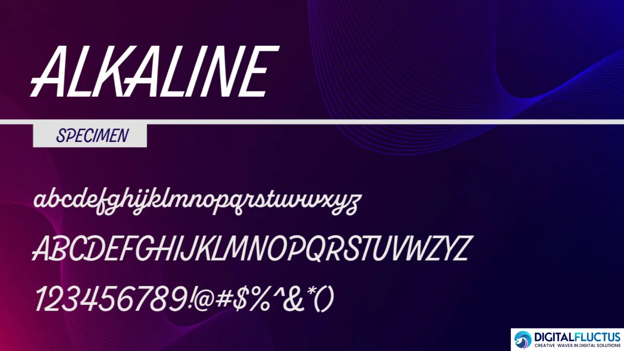
What Makes Alkaline Rock:
- Sharp, angular shapes that scream confidence
- Retro vibes with a modern punch
- Eye-catching geometry that demands attention
- Perfect for designs that dare to be different
Made to Stand Out In:
- Bold headlines that grab attention
- Posters that stop people in their tracks
- Edgy branding that breaks the mold
- Any project ready to make some noise
The Rebel Spirit Think of Alkaline as your design’s secret weapon – it’s like having a rockstar in your font library! When you need typography that doesn’t just speak but SHOUTS, Alkaline brings that perfect mix of rebellion and style. 🔥
Want your designs to break free from the ordinary? Let Alkaline be your partner in creative crime! ✨
Download Link – https://fonts.adobe.com/fonts/alkaline
7. Beverly Drive Right: Where Vintage Meets Vogue!
Meet Your New Retro Romance Step into the world of Beverly Drive Right – a gorgeous script font by Amy Hood that’s like a love letter to classic American style! It’s the perfect blend of yesterday’s charm and today’s flair. 🎭
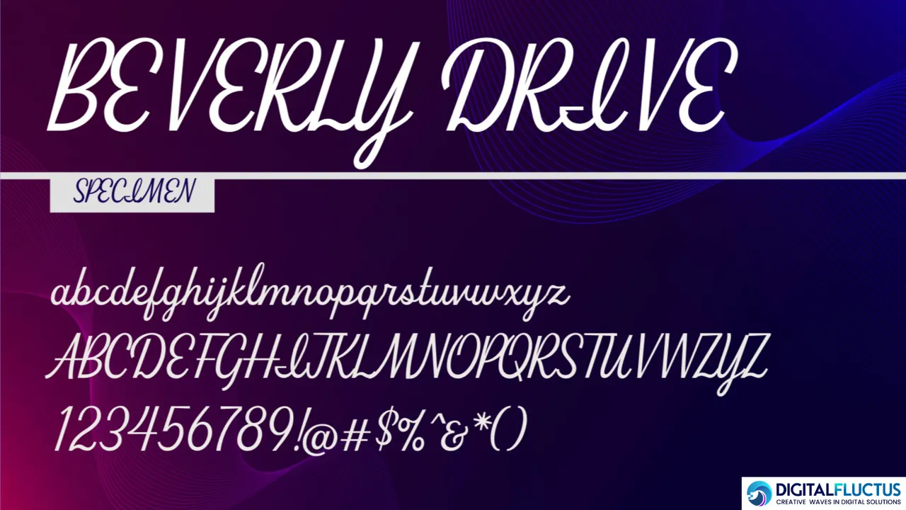
What Makes It Special:
- Gracefully right-leaning letters that dance across the page
- Smooth, flowing curves that feel like liquid gold
- Multiple weights for maximum versatility
- Now available on Adobe Fonts (hello, easy access! 🎉)
Perfect For:
- Restaurant menus that ooze vintage charm
- Apparel designs with retro soul
- Outdoor signs that turn heads
- Any project needing that classic American touch
The Hoodzpah Magic From the creative minds that brought you Lone Pine and Redondo Ave comes this new gem! Beverly Drive Right isn’t just a font – it’s like having a time machine in your design toolkit. It brings that perfect dash of nostalgia while keeping things fresh and modern. 💫
Ready to add some retro glamour to your designs? Let Beverly Drive Right take the wheel! 🌟
Download Link – https://fonts.adobe.com/fonts/beverly-drive-right
8. Gyst: Where Classic Meets Contemporary!
The Perfect Blend Say hello to Gyst – a font that’s like watching a graceful dance between old and new! This stunning creation by Roland Hörmann transforms from modern sans to elegant serif like magic. And guess what? It’s FREE with Adobe! 🎁
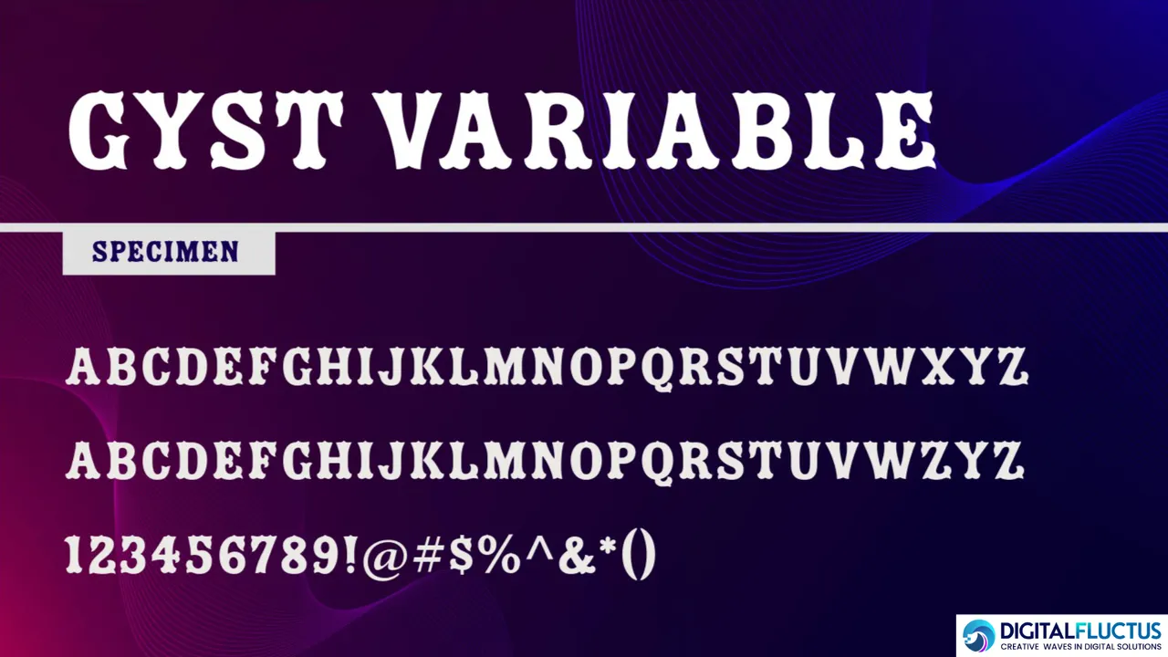
Why Gyst is Special:
- Combines Grotesque coolness with Antiqua elegance
- 4 weights in both upright AND italic styles
- Packed with beautiful alternates and ligatures
- Smooth as silk for both headlines and body text
Perfect For:
- Editorial designs that need to impress
- Elegant branding that tells a story
- Modern websites with a classic touch
- Any project where versatility is key
The Magic Touch Think of Gyst as your typography Swiss Army knife – it’s ready for anything! Need modern? It’s got you. Craving classic? Just flip to italics. It’s like having two fonts in one beautiful package. 💫
Want to add some sophistication to your designs? Gyst is ready to work its magic! ✨
Download Link – https://fonts.adobe.com/fonts/gyst-variable
9. Bilo: Where Convention Meets Creativity!
Not Your Average Sans-Serif Meet Bilo by Bold Monday – a font that dares to be different! Designed by Pieter van Rosmalen, it’s like a rebellious artist who knows exactly when to break the rules. 🎨
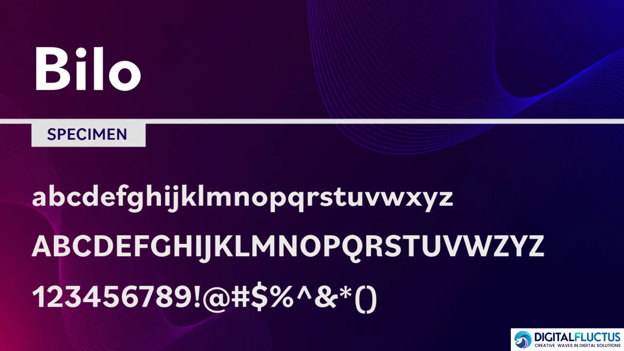
What Makes Bilo Special:
- Playful egg-shaped ovals in bold weights
- Crisp, sharp curves in lighter styles
- Free to use (yes, really!)
- Perfect mix of professional and playful vibes
Where Bilo Shines:
- Modern branding that stands out
- Editorial designs that break the mold
- Digital interfaces that need personality
- Any project ready to break free from boring grotesques
The Bold Monday Magic Think of Bilo as your design’s secret ingredient – it’s geometric, but with a twist! Its unexpected shapes and confident character make every project feel fresh and exciting. When standard fonts just won’t cut it, Bilo steps in with style. 💫
Want to make your designs remarkable? Let Bilo add that extra spark of magic! ✨
Note: While I can share what I know about Bilo’s design features, I can’t specifically predict its impact in 2025. But I can tell you it’s already making waves with its unique approach to geometric sans-serif design!
Download Link – https://fonts.adobe.com/fonts/bilo#fonts-section
10. Inter Tight: The Font That Commands Attention!
The Power Player Say hello to Inter Tight – it’s like Inter’s confident cousin who knows how to make an entrance! Created by Rasmus Andersson, this font turns up the impact while keeping things crystal clear. ✨
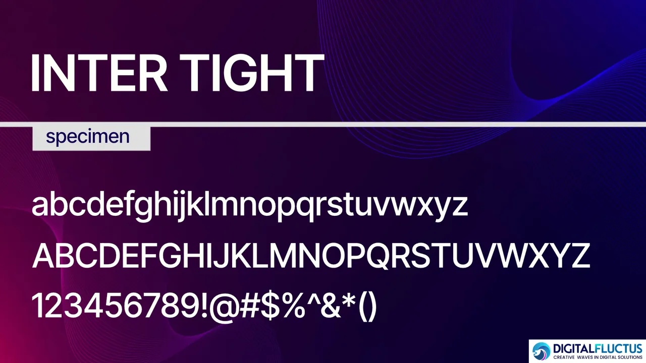
What Makes It Special:
- Perfectly tight spacing for eye-catching headlines
- Tall x-height that demands attention
- Smart OpenType features that make you look good
- Comes in both Roman AND Italic styles
Perfect For:
- Headlines that stop the scroll
- Posters that pop from across the room
- Digital designs that need extra punch
- Any project where every pixel matters
The Smart Features:
- Slashed zero for crystal-clear numbers
- Contextual alternates that adjust to their neighbors
- Tabular numbers that line up beautifully
- Everything you loved about Inter, but bolder!
Why You’ll Love It Think of Inter Tight as your typography power move – when you need to make a statement, it delivers! Whether you’re designing for screens or print, this font brings that perfect mix of impact and intelligence. 💫
Ready to make your headlines unforgettable? Let Inter Tight do the heavy lifting!
Download Link – https://fonts.google.com/specimen/Inter+Tight


No comment